Code
library(knitr)
library(tidyverse)
library(socviz)
library(ggthemes)
library(ggrepel)
library(ggtext)
library(hrbrthemes)
library(gapminder)library(knitr)
library(tidyverse)
library(socviz)
library(ggthemes)
library(ggrepel)
library(ggtext)
library(hrbrthemes)
library(gapminder)The following data is for Question 1:
gapminder <- gapminder::gapminder#0072B2 for dots.Answer:
continents <-c("Africa", "Americas", "Asia", "Europe")

gapminder_1 <- gapminder::gapminder|>
  filter(year==2007) %>%
  filter(continent %in% continents)

# gapminder_1 <- gapminder_1|>
#   filter(continent==continents)

ggplot (gapminder_1,
        aes(x= lifeExp,
            y = reorder(country, lifeExp))) +
  geom_point(color="#0072B2") +
  geom_text(aes(label=lifeExp), hjust = -.25) +
  facet_wrap(continent~.,
                           scales = "free_y"                                                                      ) +
  xlim(c(40,110))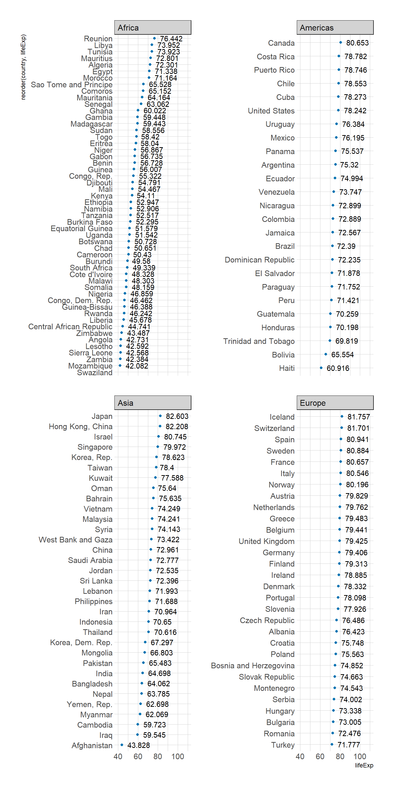
Answer:
Europe has the overall highest life expectency
The following data is for Question 2:
n_tweets_long <- read_csv(
  'https://bcdanl.github.io/data/n_tweets_long.csv')
Rows: 24 Columns: 3
── Column specification ────────────────────────────────────────────────────────
Delimiter: ","
chr (1): type
dbl (2): year, n
ℹ Use `spec()` to retrieve the full column specification for this data.
ℹ Specify the column types or set `show_col_types = FALSE` to quiet this message.Replicate the following ggplot.
type values:
n_ot_us: Number of US tweetsn_ot_wrld: Number of worldwide tweetsn_rt_lk_us: Number of US retweets & likesn_rt_lk_wrld: Number of worldwide retweets & likesmaroon and #428bca properly.Answer:
# d <- data.frame(x=1:10, y=1/(10:1))
# ggplot(d, aes(x= year, y=)) + geom_bar(stat="identity")

# library(ggplot2)

n_tweets <- n_tweets_long %>%
  filter(type == 'n_ot_us' | type == 'n_ot_wrld' ) %>%
  mutate(type = ifelse(type == 'n_ot_us', "US", "Worldwide"))


n_retweets_lks <- n_tweets_long %>%
   filter(type == 'n_rt_lk_us' | type == 'n_rt_lk_wrld' ) %>%
  mutate(type = ifelse(type == 'n_rt_lk_us', "US", "Worldwide"))


# Create the ggplot bar graph
ggplot(n_tweets, aes(x = year, y = n)) +
  geom_bar(aes(fill = type), stat = "identity", position = "dodge") +
  geom_line(data = n_retweets_lks, aes(color = type),
            linewidth=3) +
  geom_point(data = n_retweets_lks, size=3) +
  scale_fill_manual(values = c("maroon", "#428bca")) +
  scale_color_manual(values = c("maroon", "#428bca")) +
  scale_x_continuous(breaks = 2012:2017) +
  labs(x = "Year",
       y = "Number of Tweets, Retweets & Likes\n(in thousand)",
       fill="Tweets", color="Retweets and likes") +
  guides(fill = guide_legend(reverse = TRUE,
                             label.position = "bottom",
                             keywidth = 3,
                             nrow = 2,
                             order = 1),
         color = guide_legend(reverse = TRUE,
                             label.position = "bottom",
                             keywidth = 3,
                             nrow = 2,
                             order = 2)) +
  theme_minimal()+
theme(legend.position = "top")As the years increase the number of tweets, reweets and likes increase greatly. With worldwide having a larger increase.
The following data set is for Question 3:
electricity <- read_csv(
  'https://bcdanl.github.io/data/electricity-usa-chn.csv')
Rows: 360 Columns: 5
── Column specification ────────────────────────────────────────────────────────
Delimiter: ","
chr (3): energy, label, iso3c
dbl (2): year, value
ℹ Use `spec()` to retrieve the full column specification for this data.
ℹ Specify the column types or set `show_col_types = FALSE` to quiet this message.electricity %>%
count(iso3c)# A tibble: 2 × 2
iso3c n
<chr> <int>
1 CHN 180
2 USA 180electricity <- electricity %>%
mutate(iso3c = ifelse(iso3c == 'CHN',
"China",
"United States"))electricity %>%
count(iso3c)# A tibble: 2 × 2
iso3c n
<chr> <int>
1 China 180
2 United States 180Answer:
ggplot(data = electricity) +
  geom_line(aes(x = year,
                y = value ,
                color = energy),
            linewidth=3) +
  geom_hline(yintercept = 0) +
  geom_vline(xintercept = 1985) +
facet_wrap(iso3c~.,) +
scale_colour_viridis_d(option = "plasma")+
  theme(legend.position = "top")+
   labs(x = "Year",
       y = "Electricity Generartion\n(TWh)",
        color="Energy")+
  guides(color = guide_legend(label.position = "bottom",
                keywidth = 5))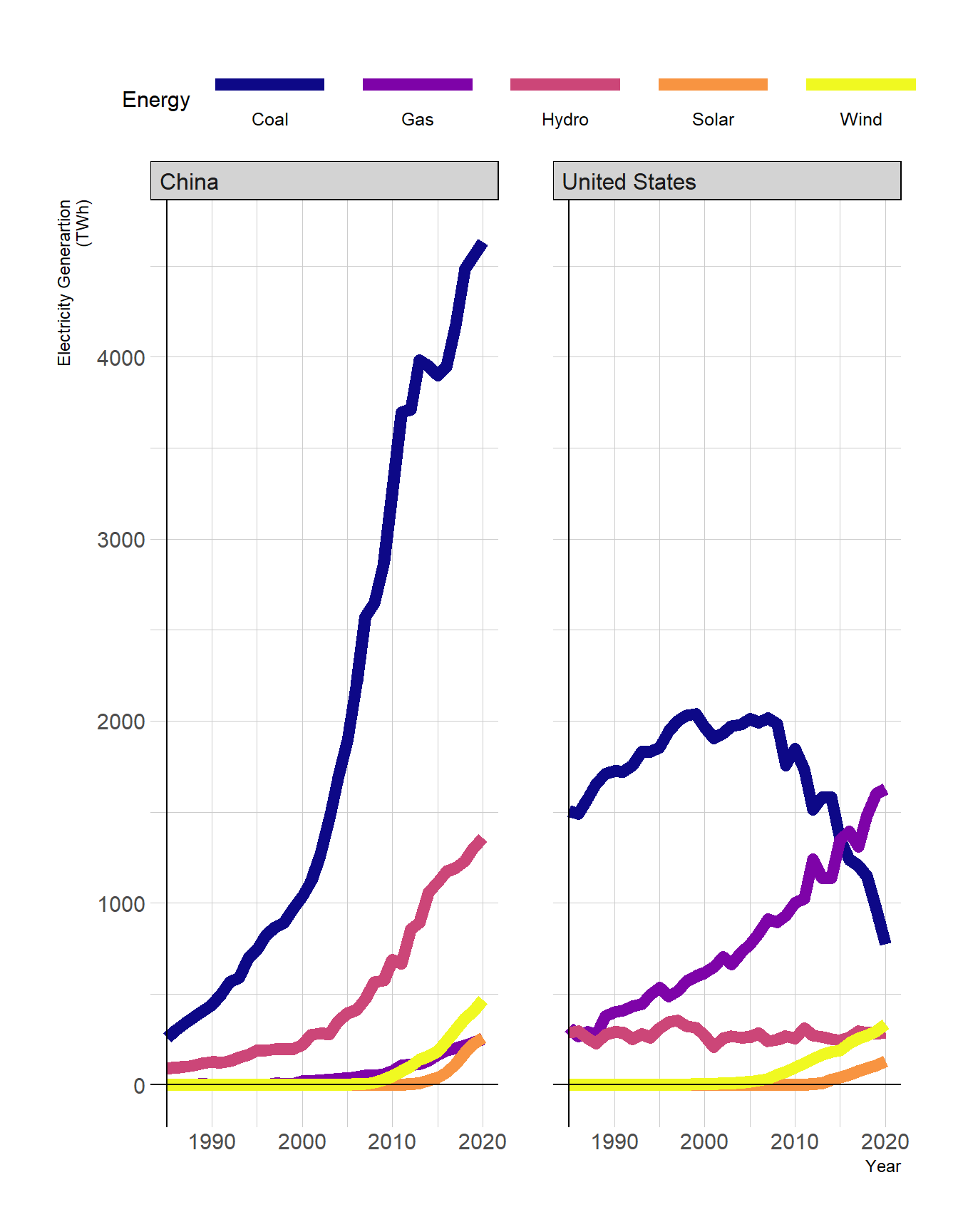
Answer:
electricity <- electricity %>%
  group_by(iso3c, year) %>%
  mutate(pct = value / sum(value))


ggplot(data = electricity) +
  geom_line(aes(x = year,
                y = pct ,
                color = energy),
            linewidth=3) +
  geom_hline(yintercept = 0) +
  geom_vline(xintercept = 1985) +
facet_wrap(iso3c~.,) +
scale_colour_viridis_d()+
  theme(legend.position = "top")+
   labs(x = "Year",
       y = "Electricity Generartion\n(TWh)",
        color="Energy")+
  scale_y_continuous(labels = scales::percent) +
  guides(color = guide_legend(label.position = "bottom",
                keywidth = 5))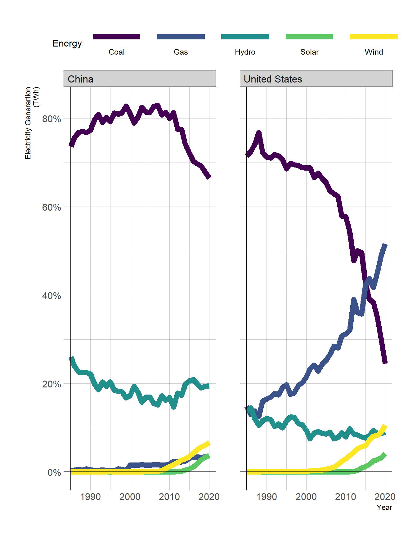
The following data set is for Question 4:
starbucks <- read_csv(
  'https://bcdanl.github.io/data/starbucks.csv')
Rows: 1116 Columns: 15
── Column specification ────────────────────────────────────────────────────────
Delimiter: ","
chr (4): product_name, size, trans_fat_g, fiber_g
dbl (11): milk, whip, serv_size_m_l, calories, total_fat_g, saturated_fat_g,...
ℹ Use `spec()` to retrieve the full column specification for this data.
ℹ Specify the column types or set `show_col_types = FALSE` to quiet this message.Product_Name: Product NameSize: Size of drink (short, tall, grande, venti)Milk: Milk Type type of milk used
0 none1 nonfat2 2%3 soy4 coconut5 wholeWhip: Whip added or not (binary 0/1)Serv_Size_mL: Serving size in mlCalories: KCalTotal_Fat_g: Total fat gramsSaturated_Fat_g: Saturated fat gramsTrans_Fat_g: Trans fat gramsCholesterol_mg: Cholesterol mgSodium_mg: Sodium milligramsTotal_Carbs_g: Total Carbs gramsFiber_g: Fiber gramsSugar_g: Sugar gramsCaffeine_mg: Caffeine in milligramsstarbucks data.frame
caffeine_mgml: Caffeine in milligrams per mLcalories_kcml: Calories KCal per mLAnswer:
starbucks <- starbucks |>
  mutate(caffeine_mgml = caffeine_mg/serv_size_m_l) |>
mutate(calories_kcml = calories/serv_size_m_l)caffeine_mgml and a mean calories_kcml for each product_name.Answer:
starbucks_1 <- starbucks |>
  group_by(product_name) |>
  summarise(caffeine_mgml = mean(caffeine_mgml),
            calories_kcml = mean(calories_kcml),
) For the top 10 product_name in terms of caffeine_mgml and the top 10 product_name in terms of calories_kcml, replicate the following ggplot.
Use the following commands for showing texts in the plot:
# install.packages("showtext")
library(showtext)
Warning: package 'showtext' was built under R version 4.3.3Loading required package: sysfontsWarning: package 'sysfonts' was built under R version 4.3.3Loading required package: showtextdbWarning: package 'showtextdb' was built under R version 4.3.3showtext_auto()
font_add_google("Annie Use Your Telescope", "annie")starbucks_2 <- starbucks_1 |>
arrange(-caffeine_mgml)|>
head(10)
starbucks_3 <- starbucks_1 |>
arrange(-calories_kcml)|>
head(10)
starbucks_4 <- rbind(starbucks_2, starbucks_3)
s<- ggplot(starbucks_4,
aes(x = calories_kcml,
y = caffeine_mgml) )+
geom_point(aes(color = product_name))+
geom_text_repel(aes(label = product_name,
color = product_name),
family = "annie") +
guides(color = "none") +
labs(x = "Calories",
y = "Caffeine\n(mgML)",
title = "STARBUCKS DRINKS",
subtitle = "Caffeine or Calories, which one would you go?")+
annotate("richtext",
x = 0.6 ,
y = 0.5 ,
label = "<img src='https://bcdanl.github.io/lec_figs/starbucks.png' width='100'/>",
color = NA) +
annotate(geom = "rect",
xmin = 0, xmax = .34,
ymin = .41, ymax = .8,
fill = "lightgray",
alpha = 0.5) +
annotate(geom = "rect",
xmin = 0.68, xmax = .93,
ymin = 0, ymax = .34,
fill = "lightgray",
alpha = 0.5)+
theme(plot.title = element_text(colour ="#00704A" ) )
s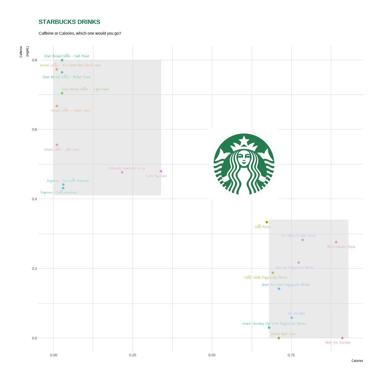
- Use the following `annotate()` geom to insert the starbucks image in the plot:

::: {.cell}

```{.r .cell-code}
annotate("richtext",
           x = Calories ,
           y =  Caffeine,
           label = "<img src='https://bcdanl.github.io/lec_figs/starbucks.png' width='100'/>",
           fill =  ,
           size =  ,
           color =  )
:::
geom_text_repel() geom to use the annie fontgeom_text_repel(max.overlaps = ,
size = ,
min.segment.length = ,
point.padding = ,
box.padding = ,
show.legend = ,
family = "annie")#00704A, for the title.Answer: